Both bar charts and candlestick charts are commonly used tools in technical analysis to visually represent price movements in financial markets. They both display the same type of information (open, high, low, and close prices) but do so in slightly different ways. The choice between bar charts and candlestick charts often comes down to personal preference and the type of information a trader wants to emphasize.
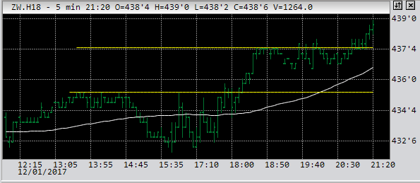
In a bar chart, each price interval (such as a day or an hour) is represented by a vertical line and two horizontal ticks. The top tick represents the highest price during that interval, the bottom tick represents the lowest price, and the vertical line connects the opening price on the left and the closing price on the right.
Candlestick charts also display the same open, high, low, and close prices, but they do so in a more visually distinct way. Each interval is represented by a rectangular "candlestick." The top and bottom of the candlestick represent the high and low prices, and the body of the candlestick (the rectangle) represents the difference between the opening and closing prices. If the closing price is higher than the opening price, the body is typically filled or colored. If the opening price is higher than the closing price, the body is usually left blank or colored differently.
Bar charts are often preferred by commodity or grain futures traders for a few reasons:
Bar charts can be less visually cluttered, making it easier for traders to focus on the key price points (open, high, low, and close) without the additional visual elements that candlestick charts introduce.
Bar charts provide a clear representation of price ranges between the open, high, low, and close, making it straightforward for traders to compare price movements across different time intervals.
Bar charts have been used in commodity and grain markets for a long time, contributing to their continued popularity and familiarity among traders in these markets.
I feel that the simplicity of bar charts help avoid potential biases introduced by the visual patterns and formations that can be associated with candlestick charts and, that's why, I prefer bars before candles.
 |
| old wheat futures chart, showing the simplicity of it |
<< home